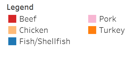
Americans love meat, and per capita, we eat more than any other country in the world. When I think of the American meat industry, I think of beef. But beef is not #trending in the US: since 1976 beef consumption has slowly declined. Here’s what it looks like:
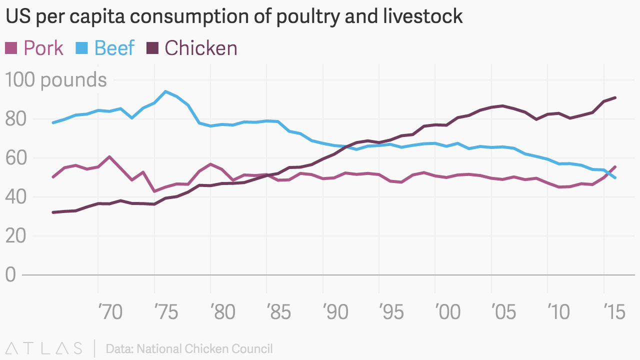
Chicken is on the rise! Since 1965, meat consumption has been generally increasing, and chicken is the main driver behind that growth.

I created these graphs as part of Makeover Monday, in which users improve on a visualization and its underlying dataset. I was curious to see how consumption was changing overall, as well as just how much chicken and beef had risen and fallen. Here is the original graph:

Notes:
All consumption data from the National Chicken Council